

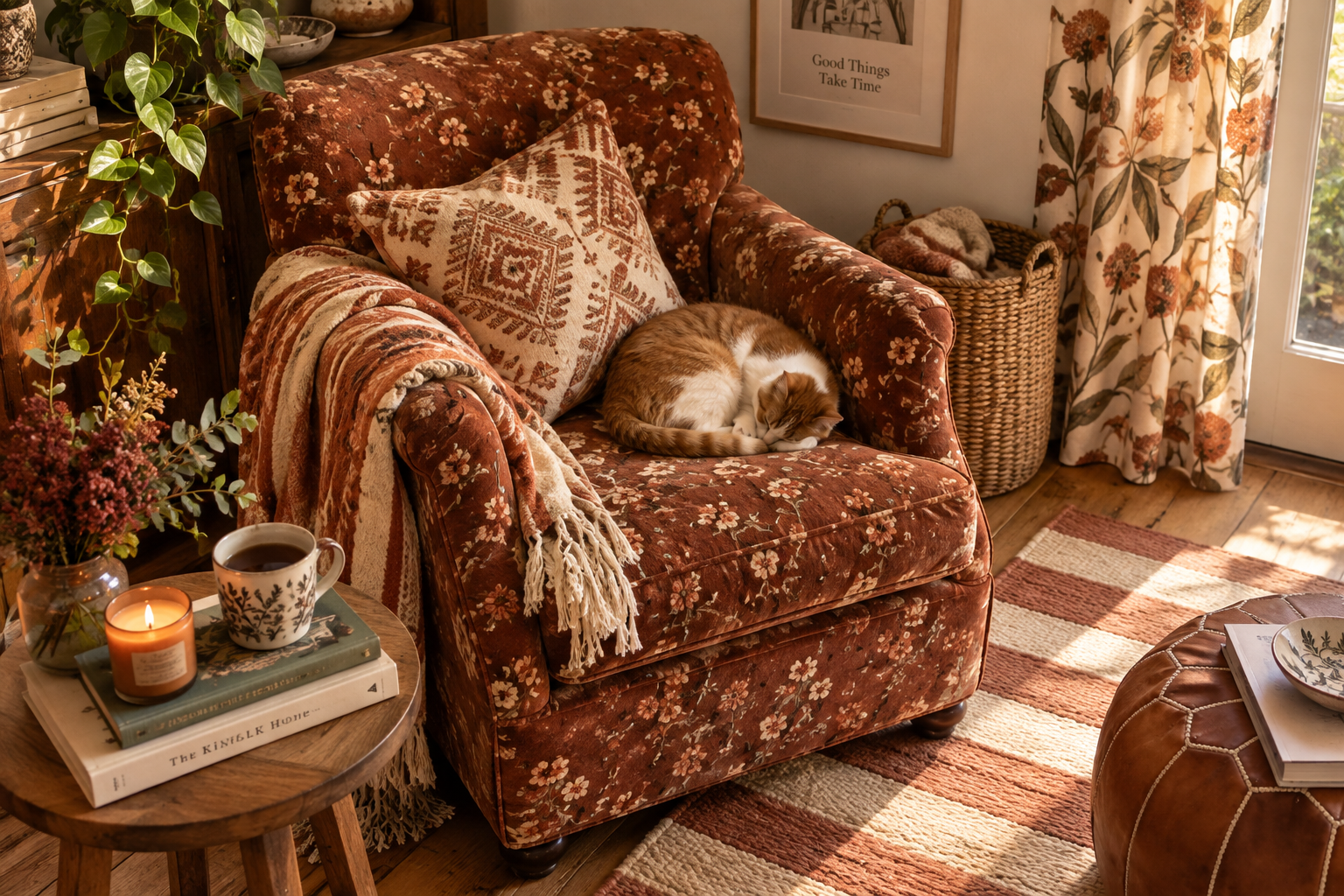


There’s a certain kind of living room I keep noticing lately. It isn’t perfectly coordinated. The sofa cushions don’t come from the same collection. There might be a floral chair beside a striped lampshade, a slightly faded rug underneath it all, and curtains doing their own thing entirely.
And somehow, instead of looking messy, the room feels richer for it.
That’s essentially the idea behind printmaxxing, one of the more interesting decorating directions to emerge for fall 2026. Rather than choosing one statement pattern and keeping everything around it safe, printmaxxing encourages several prints to live together in the same room.
The important distinction is that this isn’t pattern for pattern’s sake.
The best printmaxxed rooms still have order. A color repeats. One print is noticeably larger than another. A stripe settles things down. Plain upholstery or warm wood gives your eyes somewhere quiet to land.
In simple terms, printmaxxing in home decor means layering different patterns—such as florals, stripes, checks, botanicals, and geometrics—while using color and scale to make them feel connected rather than chaotic.
And that last part matters far more than how many prints you use.
Why Does Printmaxxing Feel So Right Now?
Part of its appeal is probably a reaction to how carefully edited interiors have looked for the past several years.
We’ve lived through the all-beige room. The perfectly coordinated neutral sofa. The home where every object seems to have been selected from exactly the same mood board.
Beautiful? Often.
Personal? Not always.
Printmaxxing pushes things in the opposite direction. It makes room for the cushion you bought years ago, the old chair you don’t want to reupholster, the rug inherited from someone else, and the fabric you fell in love with even though it doesn’t technically “match” anything.
That slightly collected quality is what gives the look its charm.
And fall naturally lends itself to it. Once the evenings get shorter, our rooms begin taking on more layers anyway. Throws return to sofas. Curtains feel important again. Rugs, lamps, cushions, and upholstered pieces suddenly have much more presence.
Pattern adds another kind of warmth.
It’s also why printmaxxing doesn’t have to look wildly maximalist. Current designers using the approach are doing everything from bold wallpaper-and-upholstery combinations to much quieter rooms where only two or three patterns are layered together.
How Do You Mix Patterns Without Making a Room Feel Busy?
Start with the piece that already has the most personality.
It sounds almost too simple, but this is where I’d begin in a real room.
Maybe it’s your rug. Maybe it’s an upholstered armchair you’ve had for years. Maybe it’s the floral curtains that everyone comments on when they visit.
Let that become the print everything else responds to.
Say you have a large botanical fabric with rust-colored flowers, olive leaves, cream in the background, and a little brown running through it.
You could put another floral beside it, but the room would probably be more interesting if you didn’t.
Try an olive-and-cream stripe instead.
Then perhaps a small check with a little brown in it.
The prints are different, but the colors are quietly repeating, and that’s what makes the combination feel intentional.
Interior designers have used this approach for years: begin with a multicolored anchor pattern, pull shades from it, and then vary the type and scale of the supporting prints.
You don’t need every fabric to contain every color.
One repeated shade can be enough.
Color Matters More Than Matching
If there’s one thing that makes pattern mixing easier, it’s keeping the color palette slightly tighter than the prints themselves.
Imagine three cushions.
One is floral. Another has stripes. The third is geometric.
At first glance they have almost nothing in common. But all three contain some combination of olive, burgundy, and cream.
Suddenly they feel related.
That’s the difference between mixing prints and simply collecting them.
For fall, I particularly like palettes that feel seasonal without becoming too literal: olive with rust and warm cream; tobacco brown with faded blue; burgundy with soft pink; chocolate with mustard; deep navy with caramel and off-white.
You can introduce plenty of personality within those few shades.
In fact, the more disciplined the colors are, the more adventurous you can usually be with pattern.
It’s one of the oldest designer tricks in the book, and still one of the most dependable. Establishing a color relationship allows even fairly unexpected patterns to sit comfortably together.
Why Pattern Scale Changes Everything
This is usually where a room either comes together or begins to feel slightly frantic.
Imagine a sofa covered with three cushions: a tiny floral, a tiny geometric, and a tiny check.
Nothing is technically wrong with them, but from across the room they all become equally busy.
Now swap the first one for a large, loose floral.
Instantly, there’s hierarchy.
Your eye sees the floral first, then the smaller patterns.
That difference in scale is what gives a layered room rhythm.
A bold botanical curtain might work beautifully with a fine stripe. A large patterned rug can sit under chairs covered in smaller motifs. An oversized check can handle a delicate floral nearby because they aren’t both fighting for attention at the same level.
Designer Sara Gilbane describes this same principle when recommending a mix of large- and small-scale designs rather than putting very similar patterns directly beside one another.
You don’t need to measure anything.
Just stand across the room and look.
If two prints seem equally loud from a distance, make one quieter.
Can You Mix Florals and Stripes?
Absolutely—and if you’re nervous about mixing patterns, this may be the best place to begin.
Florals have movement. Stripes bring structure.
That contrast is exactly why they sit so comfortably together.
Picture a faded floral armchair with a narrow striped cushion. Or botanical curtains beside a striped Roman blind. Even a floral duvet feels more intentional once you add a simple ticking stripe somewhere nearby.
Stripes have another advantage: at a smaller scale, they almost start behaving like a neutral.
They introduce pattern without bringing another complicated motif into the room.
So if you’re ever holding a floral cushion and wondering what goes beside it, look for a stripe that picks up one of its quieter colors.
Nine times out of ten, you’ll be surprised by how easily it settles everything down.
Let One Print Have the Best Seat in the Room
Even a heavily patterned interior needs a lead character.
If your wallpaper is spectacular, let people notice it.
The armchair sitting against it can still be patterned, but perhaps the print is smaller or the colors are softer.
If your sofa is covered in a sweeping floral, don’t make the curtains compete for exactly the same amount of attention.
If you have an extraordinary rug, allow some of the upholstery above it to be quieter.
This doesn’t mean the supporting pieces have to disappear.
They just don’t all need to introduce themselves at once.
A room feels far more sophisticated when your eye has a natural place to begin and then discovers the other details gradually.
That’s what beautifully layered interiors do so well. You notice something new the longer you sit in them.
The Plain Pieces Are Doing More Work Than You Think
This may be the most important part of the whole look.
Not everything should be patterned.
That plain linen sofa? Keep it.
The dark wooden side table? Perfect.
The undecorated stretch of wall beside the floral curtains? Leave it alone.
Pattern needs quiet company.
Wood, stone, rattan, leather, linen, plain velvet, woven baskets, and even empty space can all soften a room that contains several prints.
I think this is where people sometimes misunderstand maximalist decorating. The most beautiful layered rooms often contain a surprising amount of restraint.
There may be five different prints, but there’s also a large plain wall.
Or a riot of fabric surrounded by simple antique wood furniture.
Or elaborate curtains beside a completely unpatterned sofa.
It’s contrast that makes the pattern interesting.
What If Your Home Is Mostly Neutral Right Now?
You don’t need to jump straight from a cream sofa to wallpaper and floral upholstery.
Actually, I wouldn’t.
Start with the sofa you already have.
Add one cushion with a pattern you genuinely love.
Then put a stripe or check beside it.
Add a throw in one of the colors shared by those two cushions.
Live with it.
After a few days, you may realize the room already has enough. Or maybe you notice the lamp in the corner suddenly looks a little plain and would be wonderful with a patterned shade.
That’s a much better way to build the look than buying an entire “printmaxxing” room in one weekend.
The rooms we tend to remember don’t feel newly coordinated.
They feel accumulated.
Does Printmaxxing Work in a Small Room?
Yes—and small rooms can actually handle more pattern than people give them credit for.
The answer isn’t necessarily making every print tiny.
One confident large-scale pattern can make a small room feel more intentional.
Imagine a compact bedroom with a generous floral headboard. Add one striped cushion and a small printed lampshade, but leave the bedding relatively plain.
There’s plenty going on, yet the room still feels calm because the pattern has been concentrated in a few deliberate places.
Designers working with small rooms often make exactly this distinction: scale needs balance, but pattern itself isn’t the enemy. Layering different patterns and textures can give even compact spaces history and depth.
The real problem is when every object demands attention.
Picture This for Fall

A deep olive armchair sits beside the window.
There’s a loose floral cushion on it—nothing too pristine, maybe something that looks as though you could have found it in an old country house.
Next to the chair is a dark wooden table with a lamp wearing a narrow striped shade.
Underneath everything is a faded rug in brown, red, and cream.
A plain wool throw hangs over the chair arm.
There isn’t a pumpkin in sight.
And yet the room feels like fall.
That’s what makes printmaxxing more interesting to me than many seasonal decorating trends.
You’re creating warmth through layers rather than decorating around a theme.
The Mistake That Makes It Look Too Perfect
Please don’t buy all your patterns as a matching set.
A collection of cushions where one is floral, one is striped, and one is geometric—but every single fabric has been manufactured to coordinate perfectly—can technically follow all the rules and still feel strangely flat.
You want one thing that doesn’t quite belong.
Maybe an older rug.
A vintage chair.
A print with slightly more blue than you planned.
That little bit of friction is often what makes the rest of the room feel personal.
Rebecca Atwood, who has written extensively about living with pattern, makes a similar point: there isn’t one magic formula; the character comes from recognizing what you genuinely like and layering pieces that tell your own story.
And I think that’s the best way to approach printmaxxing.
- Not as another decorating test to pass.
- Not as an excuse to buy fifteen cushions.
- Just permission to stop worrying quite so much about whether everything matches.
- Start with one pattern you love.
- Bring in another that shares a color but changes the scale.
- Try a stripe if you get stuck.
- Keep something plain nearby.
- Then step back and give the room a little time.
- The best pattern-mixed homes don’t look like they were finished in one afternoon.
- They look like someone has been living there—and finding beautiful things—for years.
What's Your Reaction?
